

Project overview
For many years, this company had been putting their products before brand - especially when it comes to social media. Most of their content would reflect the colour palettes formed by the brands that they were promoting at the time.
As their social media manager, I wanted to steer them in the direction of putting brand first. This would not only help their audience to distinguish their content, but it would pull together all of their social platforms and their website in way that improves the overall customer experience.
Up until this point, their brand had always been about celebrating natural hair. I didn’t want to change this, I wanted to amplify it.
So I spent hours researching different hair and beauty brands, making sure to take note of those that had a similar target audience. From this I established that minimalism has a powerful effect - especially when it comes to clean beauty!
With my research in hand, I began producing a brand board that included the new type face, content examples, a colour palette, and a proposal for a new logo.
When presented with the brand board, the founders of the company were happy with the new direction, making only one request - that we alter the logo.
Once that was designed, we coordinated the launch of the rebrand across their social platforms and the website.
We made sure to introduce the new look through stories and the feed, while ensuring that the standards and values of the company remain the same - just with a brand new look!
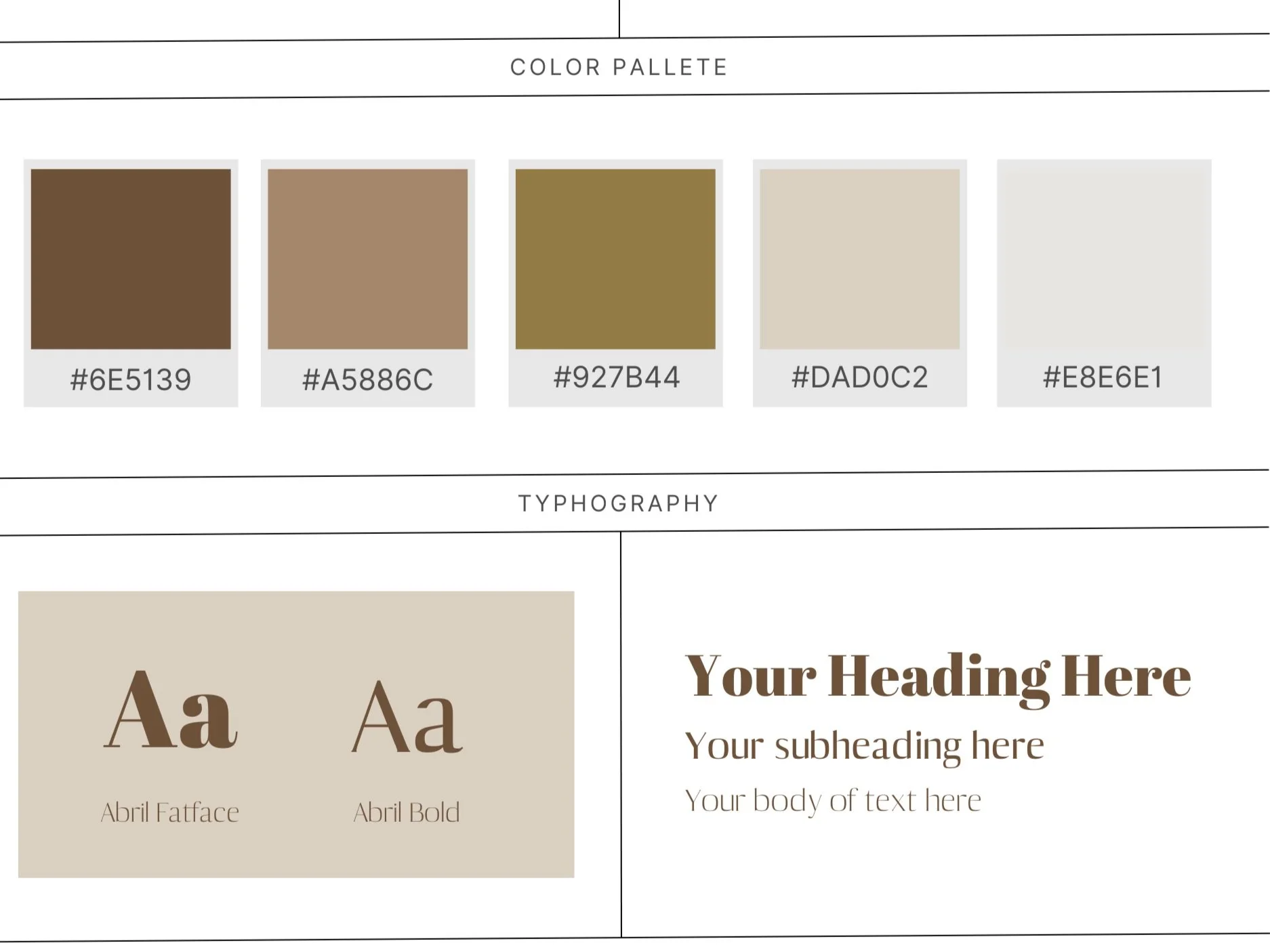
The idea behind the rebrand was to lean into the natural part of the company, so I paired earthy tones that closely reflected a calm walk through nature.
Logo changes
This company had been operating under the original purple and green logo since they first launched their website. At the time, it suited their customer base and was a realistic representation of the vibrance that they wanted to reflect.
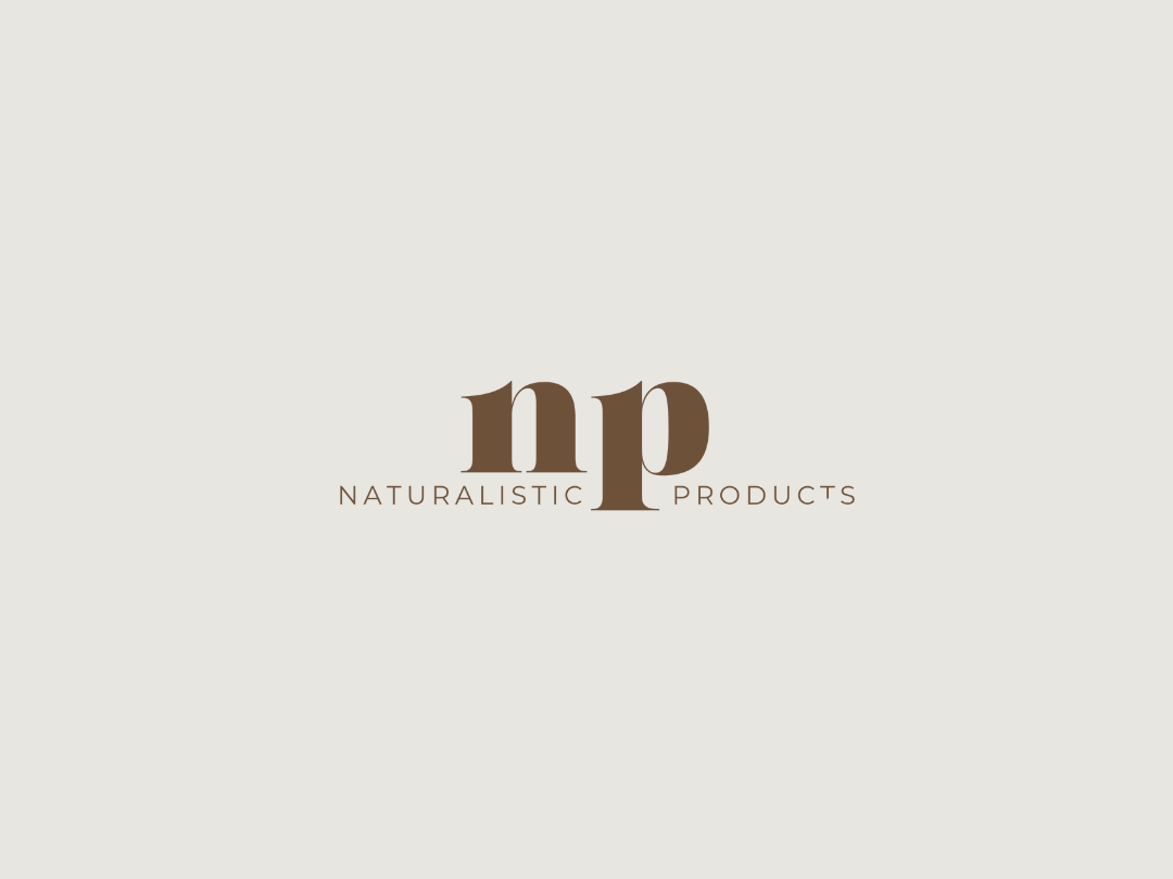
Through the rebrand, I was looking for a way to maintain the bold feel of the original logo, but with a minimalist approach. So when I presented my interpretation of the logo, it was simply our bold typeface with the name of the company written beneath.
Making their changes, the founders were clever to curve out some of the typeface while changing the placement of their company name. These additions helped solidify the minimalist approach, while presenting a more mature visual of the company.

Content before the rebrand


Content after the rebrand


How the rebrand affected results
After settling into the new content, three things happened.
First of all, our content began to gain more reach. After speaking with some of our newer followers, they confirmed that it was because they began to recognise us when the content was recommended on their homepages or when they were scrolling through the explore page.
This then had a direct result on our engagement, as more and more people began to interact with the content that we were putting out on a regular basis.
Finally, the amount of web traffic from social media began to rise, as each product is not only presented in a way that connects with our audience, but they now connect the brand with trustworthiness.
FAQs
-
The skills I used in this project include:
Audience research
Competitor research
Basic logo design
Visual curation -
It wasn’t the first rebrand that I’ve been a part of, but it’s the first one that I oversaw myself.